ROLE
- User Research + Testing
- Data Analysis
- Ideation + Sketching
- Client Communications
DURATION
- 3-Week Sprint
TEAM
- Three
TOOLS
- Pen + Paper
- Adobe XD
- Keynote
- Google Forms + MTurk
- Excel
- IBM SPSS
DELIVERABLES
- Clickable Prototype (High-Fidelity)
- Client Presentation
Role
- User Research + Testing
- Data Analysis
- Ideation + Sketching
- Client Communications
Team
- Three
Duration
- 3-Week Sprint
Tools
- Pen + Paper
- Adobe XD
- Keynote
- Google Forms + MTurk
- Excel
- IBM SPSS
Deliverables
- Clickable Prototype (High-Fidelity)
- Client Presentation
Our Objective:
“Design an open platform that supports holistic health and fitness by promoting social and communal interactions.”
Project KPIs:
- VC funding raised through showcasing clickable prototype
- Positive concept and usability test results
Our Solution:
Designed an iOS native app featuring:
- User Dashboard (resistance controls + workout metrics)
- Progress Tracking (data visualizations + logs for D-W-M-Y)
- Group/Solo Fitness Challenges (including structured workout content + gamification elements)
What is Stride (and What Were We Building)?
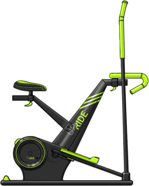
My team and I collaborated with a new startup to create a digital platform to work in tandem with an exercise machine they had invented- a stationary bike that converts into an elliptical. Stride’s creator, a former marathoner, initially thought of the concept when he needed a low-impact solution to continue an active lifestyle after difficulties with arthritis. Through his research, he realized runners face huge injury rates (hence why participation drops substantially around age 40), and that the most popular low-impact equipment purchases are ellipticals and stationary bikes. Value Proposition: Stride is both, for the cost (and footprint) of one.
The bike was to be completely controlled through the app we designed- in place of a traditional console, the machine would have an area for users to plug in their smartphones or tablets. This seemed like a smart move (touch screens on workout equipment are usually much less responsive than that of an iPhone, and why pay an extra $500 for a screen when users already have one?), but also, potentially a risky one (Will users feel intimidated by the setup? Will they even like it?). In addition to creating the interface for the bike’s controls, our client requested that we incorporate a social, gameified content-streaming element as a means to motivate users (specifically, they envisioned one that was similar to Peloton’s, but in which users could potentially upload their own content).
Research
Our client had completed some market research previously, but had not yet identified their target demographics. Moreover, because we were designing for a product that technically did not yet exist, we could not interview any existing customers. We were, however, able to use their preliminary findings to give us a sense of direction to begin our research process. We got started by drafting up a research plan, detailing the steps we believed were necessary to (1) hone in on who our target audience was, and (2) understand what common needs they share. We decided that 2 main rounds of research could address these questions effectively within our 3-week window of time.
First Round
Goal: Identify Stride’s target audience
Methods:
- In-depth interviews with client + demonstrations of machine prototype
- Supplemental articles; media reports
- Online market survey (n=59)
Findings:
- Primary Audience: Ages 35-54 (Gen X’rs); suburban; with kids
- Secondary Audience: Ages 55-70 (Baby Boomers); empty nesters
Second Round
Goal: understand common behaviors, motivators, expectations, and needs of our target audience
Methods:
- Initial interviews to understand common behaviors + motivations (n=5)
- In-depth user interviews (n=10)
- Competitive analysis
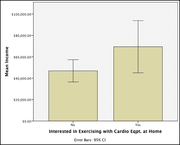
Group differences from some of our survey results- Those who own (or expressed interest in purchasing) cardio equipment for home workouts had a significantly higher annual income (M=$69,440, SD=31,593.18) than those who did not (M=$46,921, SD=34,067.13); t(46)=-1.97, p<.05.

They were also significantly older (M=48, SD=9.98) compared to participants who were not interested (M=35.54, SD=9.53); t(41)=-2.85, p<.01.
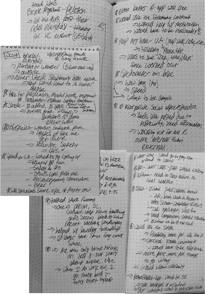
Some of my (admittedly messy) interview notes
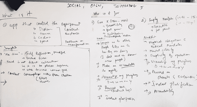
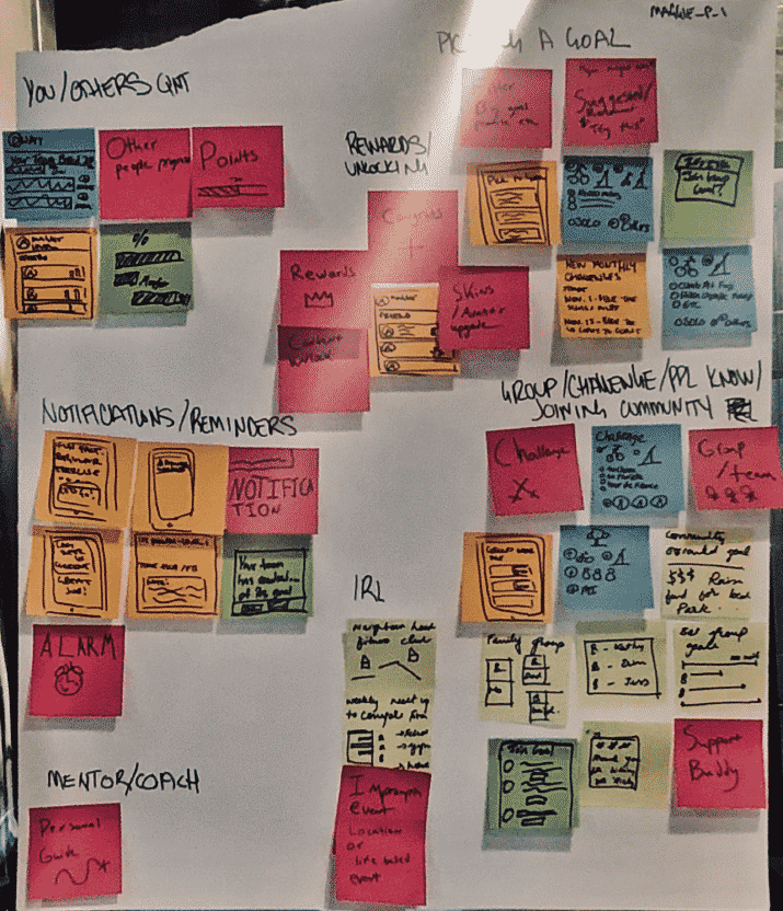
Getting a grip on some of our initial observations
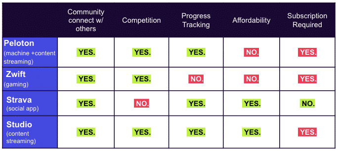
Part of a feature comparison, used in our competitive analysis
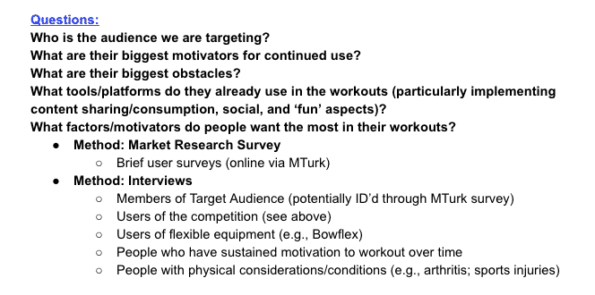
An excerpt from our research plan
Group differences from some of our survey results- Those who own (or expressed interest in purchasing) cardio equipment for home workouts had a significantly higher annual income (M=$69,440, SD=31,593.18) than those who did not (M=$46,921, SD=34,067.13); t(46)=-1.97, p<.05.
They were also significantly older (M=48, SD=9.98) compared to participants who were not interested (M=35.54, SD=9.53); t(41)=-2.85, p<.01.
Some of my (admittedly messy) interview notes
Getting a grip on some of our initial observations
Part of a feature comparison, used in our competitive analysis
An excerpt from our research plan
Synthesis
Insights
STRIDE’S EQUIPMENT
- To our surprise, the bike’s lack of console and app-based controls were not a significant deterrent for users (including baby boomers)
- Under the condition that its setup was easy and intuitive to use
- Although users believed the equipment’s 2-in-1 aspect had added value,
- Many would be concerned with its safety, sturdiness, and whether they had configured it correctly when converting to/from elliptical/bike
WORKOUT MOTIVATION
- Regardless of where or how they are working out, users find it extremely beneficial to track their workout progress, and seeing it visually helps them feel accomplished and stay motivated.
- Found to be both intrinsically + extrinsically rewarding
- Working out with others or seeing others’ progress is not necessarily about competition- most of our interviewees instead use others’ performance as a reference or a goal for where they should be.
- Thus, many users believe incorporating social components into their workout routines provides both motivation and support
- Although most of our users typically have specific go-to content they’ll access while working out (e.g., listening to music, streaming shows, etc.), they also appreciate- and even expect– some form of structured workout content (such as pre-programmed high intensity intervals, or even classes) on higher-end fitness machines.
- Users are also (emphatically) uninterested in creating or posting their own content for others- if choosing to share their progress, they’ll disclose with only a small handful of friends, not social media communities
Design Mandates
Once we had more of a thorough understanding of our target audience, we drafted up our design mandates, which we split into 2 different use cases. Given the breadth of concepts + features that were requested, this was mainly to help us prioritize our focus and time allocation over the rest of the design sprint.
BASIC USE CASE
1. Design a system that allows customers to be able to use the bike (safely) by utilizing:
An area for users to adjust machine controls (e.g., resistance) and view metrics
Real-time instructions and feedback/confirmation for converting the equipment states
SECONDARY USE CASE
2. Implement features that motivate customers to continue to use the bike (long-term) by:
Providing accountability towards fitness goals through visualizations of progress + achievements
- (Utilizing Stride’s advantage: No console means fitness data is instantly synced + accessible through the app)
Creating the sense of
- Community & support by allowing users to connect & interact with one another
- Structured content through offering pre-determined courses and workouts
- Engagement/fun through gamification elements
Solutions
Ideation + Sketching
Once we had laid out our design mandates, we began ideating concepts (and their accompanying features) in-depth. We completed a design workshop, in which we used each of our mandates as prompts, and sketched out 6-8 quick concepts for each. We also invited our client to participate and weigh-in on the process, which proved to be extremely valuable. Afterwards, we prioritized each concept by (a) how effectively it addressed our mandates, as well as our client’s needs, and (b) feasibility to implement, given our time and budgetary constraints. For each concept my team and I chose, we decided to complete crazy 8’s, in which each of us sketched out 8 ideas for its main features in 8 minutes. Using the same criteria as above, we then narrowed down our focus to implement our solutions (below).
A (small) glimpse into our concept ideation
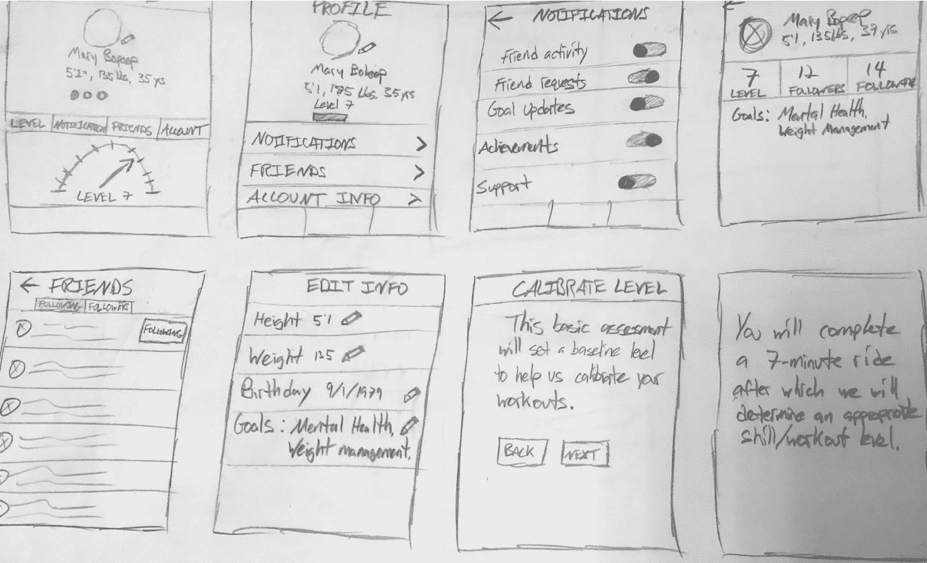
Some of our initial sketches
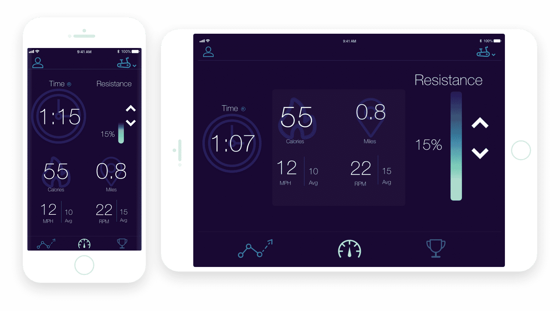
BASIC USE CASE
Allow customers to be able to use the bike (safely) by utilizing:
User Dashboard
- Providing adjustable control of resistance
- & Display of user metrics (Distance; Time; Speed; Cadence; Calories)
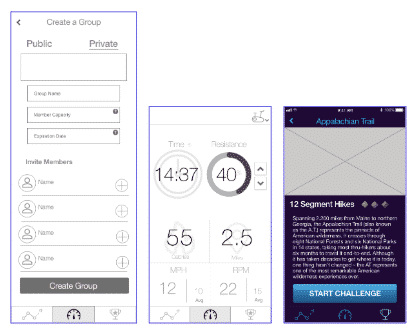
3-Step setup wizard for converting bike/elliptical
- Providing step-by-step instructions and feedback in real-time
- & Confirmation when equipment is safe to use
A demonstration of the setup wizard
SECONDARY USE CASE
Motivate customers to continue to use the bike (long-term) by implementing:
User Progress Tracking
- Data visualizations of users’ frequencies and average metrics over time
- Workout log displaying summaries of each individual workout
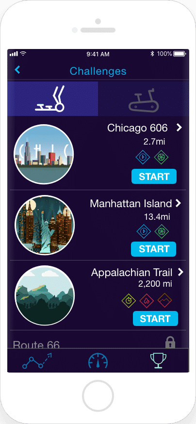
The opportunity to participate in challenges
- With options to create and join groups with other users
- Offers pre-determined courses/types of workouts
- Implements gamification elements, (e.g., levels; badges; unlocking courses)

Users can select a course to complete within a group challenge, which would emulate real trails/routes in resistance
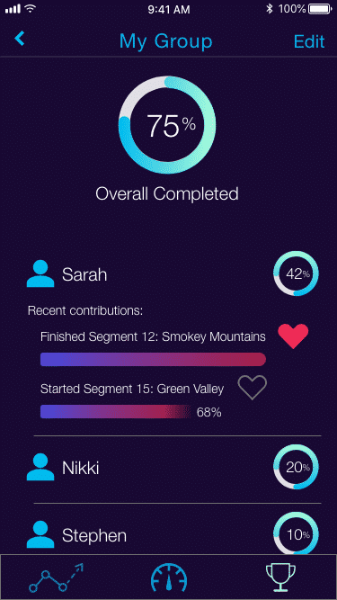
Group challenges would also provide a leaderboard of individuals’ progress, in which users can give kudos to others’ recent achievements
Users would earn badges based on the difficulty of each course they complete
Testing + Iteration
Usability testing took an especially high priority, given that we were creating something completely new, so we created a quick, rough prototype and went through iterations at a fairly rapid speed. We ended up completing 3 rounds of usability testing, each with 3-5 participants. Our main takeaways from each round of testing (and thus, our focus for improvement on subsequent iterations) were: 1. Information architecture (particularly regarding challenges) 2. Streamlining interface (icons, buttons, text sizes) 3. Hammering out logistics of groups Our final prototype was ultimately met with significant enthusiasm from our client, who plans on showcasing it in their next venture round to receive funding.
Our first, second, and third iterations
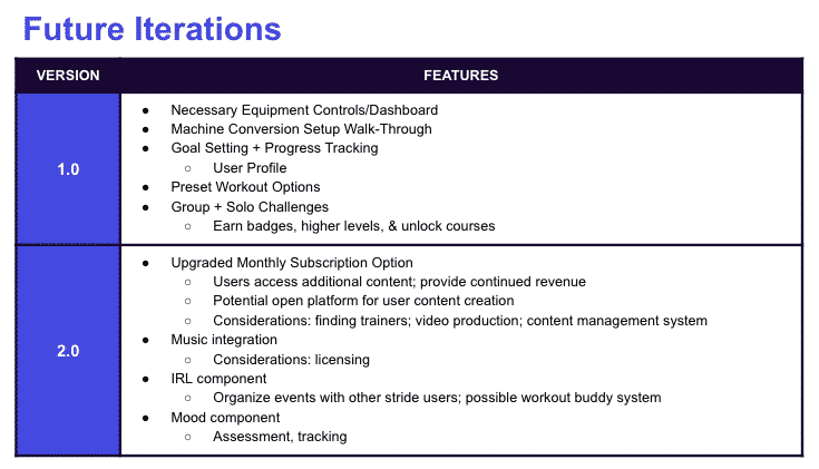
Potential considerations for future iterations
Our final prototype
Copyright © 2022 Sarah Alberti